Using a CSS preprocessor can provide powerful flexibility if you are working with a design that uses colour to help orientation, for example changing the colour scheme depending on the section of the site the current page belongs to.
These concepts can also be applied if you would like to add the option for users to select their own colour scheme or to provide accessibility options.
There are a variety of ways you could tackle this. Perhaps building multiple versions of your CSS, feeding in a different colour palette from your source files to create different versions per skin. However, this adds a bit of complexity to a project, so if you are only skinning a few elements on the page this might be overkill.
This approach requires a body class to be set which will dictate which colour scheme is to be applied, normally via some kind of setting in a CMS system or by checking a user’s profile settings.
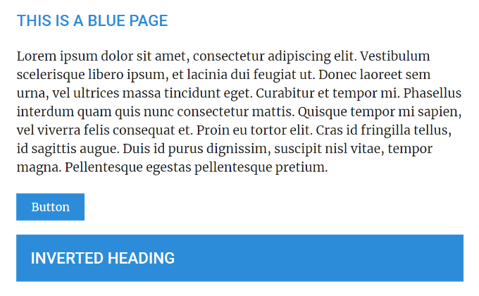
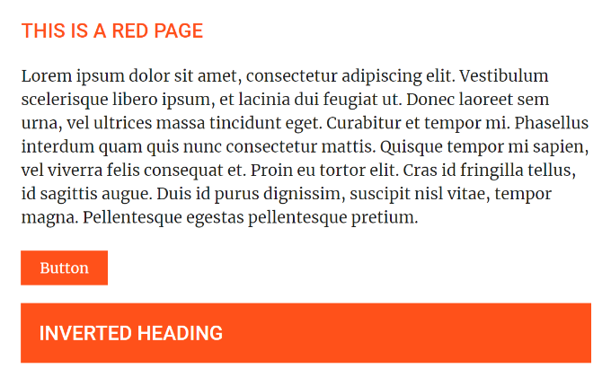
For this example let’s assume we have ‘skin-blue’ and ‘skin-red’ CSS classes that can be added to the page.
$blue: #2C8CD9;
$red: #FF511A;

@mixin skin-color {
    .skin-blue & {
        color: $blue;
    }
    .skin-red & {
        color: $red;
    }
}
@mixin skin-background {
    .skin-blue & {
        background: $blue;
    }
    .skin-red & {
        background: $red;
    }
}
@mixin skin-border-color {
    .skin-blue & {
        border-color: $blue;
    }
    .skin-red & {
        border-color: $red;
    }
}


h1, h2, h3, h4, h5 {
    @include skin-color;
    margin-bottom: 1rem;
    text-transform: uppercase;
    &.inverted {
        @include skin-background;
        color: #FFF;
        padding: 20px;
    }
}
.button {
    @include skin-background;
    display: inline-block;
    padding: 6px 20px;
    color: #FFF;
    border: 1px solid;
    margin-bottom: 20px;
    @include skin-border-color;
    &:hover {
        @include skin-color;
        background: #FFF;
    }
}
This method used the parent (&) within the @mixin meaning that the @include can be used once per selector to create rules for each skin. There is a little bit of work up front if you’re setting up quite a few colours, but it makes for very tidy rules throughout the rest of the Sass.
This can also be used within nested rules, as shown on the inverted heading and button. This is how the Sass above compiles to standard CSS:
h1, h2, h3, h4, h5 {
  margin-bottom: 1rem;
  text-transform: uppercase;
}

.skin-blue h1, .skin-blue h2, .skin-blue h3, .skin-blue h4, .skin-blue h5 {
  color: #2C8CD9;
}

.skin-red h1, .skin-red h2, .skin-red h3, .skin-red h4, .skin-red h5 {
  color: #FF511A;
}

h1.inverted, h2.inverted, h3.inverted, h4.inverted, h5.inverted {
  color: #FFF;
  padding: 20px;
}

.skin-blue h1.inverted, .skin-blue h2.inverted, .skin-blue h3.inverted, .skin-blue h4.inverted, .skin-blue h5.inverted {
  background: #2C8CD9;
}

.skin-red h1.inverted, .skin-red h2.inverted, .skin-red h3.inverted, .skin-red h4.inverted, .skin-red h5.inverted {
  background: #FF511A;
}

.button {
  display: inline-block;
  padding: 6px 20px;
  color: #FFF;
  border: 1px solid;
  margin-bottom: 20px;
}

.skin-blue .button {
  background: #2C8CD9;
}

.skin-red .button {
  background: #FF511A;
}

.skin-blue .button {
  border-color: #2C8CD9;
}

.skin-red .button {
  border-color: #FF511A;
}

.button:hover {
  background: #FFF;
}

.skin-blue .button:hover {
  color: #2C8CD9;
}

.skin-red .button:hover {
  color: #FF511A;
}
The resulting pages for this example were as follows:
In a real world application, you need to ensure you have some form of fall-back / default colour scheme set up. This is probably most easily achieved by always loading in skin class to the body of the document.